


Aqua Florilegium
Aqua Florilegium is an illustrated anthology about a boy who lives on a mysterious sinking island. Character designs and creative direction by Annika Quinn.
Title illustrations made by me, in Photoshop.
Made possible by Bonk Comics studio.


Process


This project was really good practice for me to practice my digital illustration skills, since in the past, most of my works have been with acrylic paint and a physical canvas. Here, I want to briefly document how I worked on all of the comic title cards.


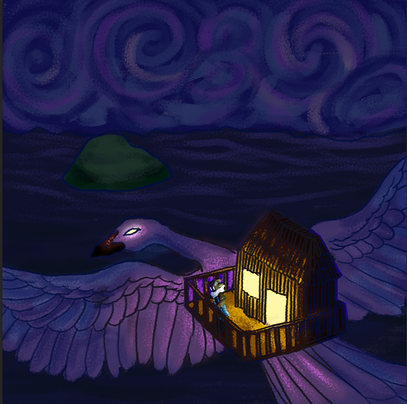


I am usually given a sketch of the composition and art from the creative director, Annika Quinn. From there, I ask her to elaborate a bit more on key elements of the illustration, but oftentimes, as it happened here, there are some tweaks that I need to adjust in photoshop to better suit her vision and designs. From there, I do simple lineart and paint in the background, so that I can better match the lighting later on to the rest of the scene.


I always color in the flat and true colors first. Then I make 4 duplicates of the flat colors, and using Photoshop's adjustment settings I make a dark version, a lighted version, an ultra dark version (for ambient occlusion) and a super bright version (for highlights), adjusting the colors in line with the principles of lighting and light falloff. Afterwards I isolate the version of the image that is supposed to represent how everything looks in shadow, and mask in the ambient occlusion.


After this, I paint in the light sources, add some glow effects, and mask in the lighting.


I use layer effects in photoshop to add in the terminator colors around the lighting easily. Afterwards I paint in some reflected lighting to make the shadows livelier.


I wanted to add some glow effects around the areas of focus (bird), and I did so using "soft light" layer styles at 50% opacity. At this point I was told that the bird was actually white, so I simply desaturated the flat colors, since I had everything in separate layers. I also realized that the image looked a bit flat, so I shaded in the background so that the further back the image, the less clearly you're able to see things. I usually do this step in the beginning, but accidentally forgot, and had to improvise here and do it as the last steps.

Lastly, I wanted to give a "trippy" feel to the image, to fit the vibes of the creative director's artwork, so I duplicated the line art, made a red and blue version of it, and moved each slightly to give an unfocused feel. I also wasn't a huge fan of the flat black line art so I used "clipping layer" to make some color variation in the line art. Finally, I made some more tweaks as I felt was necessary.